 Supaviral Ads

Supaviral brand guidelines · A living guide
Made to be noticed.
Our brand, at a glance. A shared language for the people
bringing Supaviral to life.
SUPAVIRAL ADSSmall idea.
Big momentum.IMAGINE. CREATE. REPEAT.
Big momentum.IMAGINE. CREATE. REPEAT.
01 — BRAND GUIDELINESSVG + PNG symbol, color palette, and usage notes.
Explore the guidelines01 / Overview
Good ideas deserve an audience.
Supaviral makes creative production feel possible. Our identity pairs a confident, forward-pointing mark with expressive type, clear interfaces, and a flash of orange. Every touchpoint should feel easy to enter and full of possibility.
A little momentum.
The upward-pointing symbol captures the leap from an idea to something people can see.
Expression meets clarity.
Big, characterful headlines invite you in. Simple language and calm layouts help you move forward.
Built for everyone.
Keep the brand approachable. Show the work, make the next step clear, and leave room to create.
02 / Logo
One mark. A clear direction.
Our orange symbol and serif wordmark are the core of the identity. Use the horizontal lockup for everyday placements, and the symbol when space is limited.
Supaviral Ads
Wordmark
Our name in Instrument Serif, using the same bold treatment and tight spacing as the site header.
Supaviral AdsHorizontal lockup
The default for headers, presentation covers, partnerships, and press materials.
Supaviral AdsVertical lockup
For centered compositions with more height, including square formats and end cards.
Give it breathing room.
Leave at least half a symbol-width around every edge. Use more space whenever the layout allows.
Make it readable.
Place the full-color symbol on white or ink. Pair the wordmark with a background that gives it clear contrast.
Keep the original.
Use the supplied files. Preserve the proportions, orientation, colors, and the shape of the arrow.
03 / Color
A spark of orange. Room to breathe.
White gives the work space. Ink keeps everything grounded. Supaviral orange brings energy to key actions and the moments that matter. Our supporting neutrals keep the product calm and readable.
Select a swatch to copy its HEX value. Neutrals do the everyday work; orange gets the spotlight.
Supaviral AdsSupaviral AdsSupaviral Ads
Use orange with purpose.
Reserve orange for the primary action, the symbol, and bold brand compositions. Keep long passages of copy in ink.
Keep contrast clear.
Use white text on ink and ink text on light surfaces. Use ink for small text on orange; avoid pale text on pale backgrounds.
04 / Typography
Character up front. Clarity throughout.
Two families, each with a job. Instrument Serif gives our big ideas a human voice. Geist makes the details effortless to read.
Instrument
SerifDisplay / Regular 400
SerifDisplay / Regular 400
Headlines & brand statementsRegular
Create Ads in Seconds,
Scale to Millions.
Aa Bb Cc Dd Ee Ff Gg Hh Ii Jj Kk Ll Mm
0123456789 !?&@
GeistInterface / Regular 400 + Medium 500
Body, navigation & controlsRegular / Medium
Your next ad starts
with an idea.
Add your product, choose a creator, and bring your story to life. Keep the language simple and the next step easy to find.
Aa Bb Cc Dd Ee Ff Gg Hh Ii Jj Kk Ll Mm
0123456789 !?&@
Let headlines lead.
Use serif type at a generous scale with tight, natural line spacing. Keep each thought short enough to land.
Keep details calm.
Use Geist for paragraphs, labels, and navigation. Use medium weight to emphasize, with comfortable line spacing.
Make hierarchy obvious.
Give every composition one clear starting point. Avoid competing headlines and too many changes in weight.
05 / Art direction
Real moments. Remarkable possibilities.
Our imagery connects everyday product stories with the energy of creative possibility. Lead with a clear subject, believable settings, and a point of view.

People, in their element.
Natural light, everyday settings, and an approachable presence. Leave the scene feeling lived in.
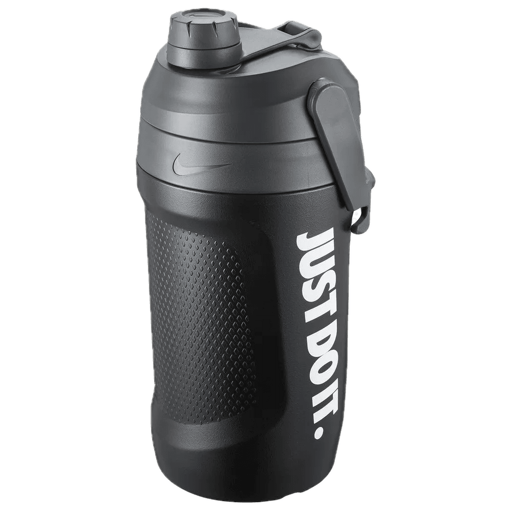
The product is the point.
Give shape, material, and distinctive details room to stand out. Keep the product easy to recognize.

Make momentum visible.
Use movement, scale, and unexpected imagery to make a simple idea feel memorable.
SUPAVIRAL ADSFROM IDEA TO AD.
Make your
next move.
FROM IDEA TO AD.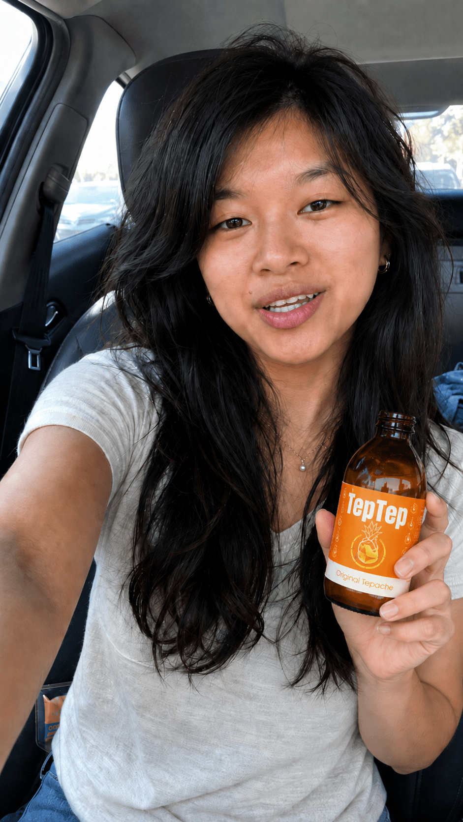 A product story, in its natural habitat.
Color with intention.
Use orange as a focal point. Let the scene bring its own natural colors instead of tinting every image orange.
Motion with a subject.
Let movement suggest energy. Keep faces and product details clear; place blur in the supporting environment.
Effects with restraint.
Soft light and subtle gradients can add depth to artwork. Keep logos, body copy, and controls crisp.
06 / Usage
Keep it unmistakably Supaviral.
A few simple habits make our pages, ads, presentations, and partner placements feel like they belong together.
Supaviral AdsDO
Protect the mark.
Use the original logo with generous clear space and a readable background.
Your next ad
starts here.Start creating
starts here.Start creating
DO
Say it simply.
Write short, direct copy. Lead with what someone can create and make the next step clear.
Ideas into ads.DO
Let one idea lead.
Use a clear focal point, a deliberate type hierarchy, and plenty of open space.
Supaviral AdsDON’T
Distort the identity.
Do not stretch, tilt, add shadows, or rearrange the elements of the logo.
Supaviral Ads
DON’T
Lose the contrast.
Avoid low-contrast pairings or arbitrary recoloring. Keep the identity easy to read.
DON’T
Turn up everything.
Avoid competing messages, decorative clutter, and claims that promise a guaranteed result.